Oral History Mapping
The idea to map the oral history recordings began during a meeting where I brought a list of locations mentioned in the interviews. To identify these informal sites, I connected Google Earth to a monitor, and within minutes, Jack was guiding me through the 3D landscape and there was a bit of a spark as we were understanding the area in a more complete way. After discussing more complex programmatic solutions to link the recordings with geographic data, I decided to simplify the concept by creating a video combining these elements.
✺
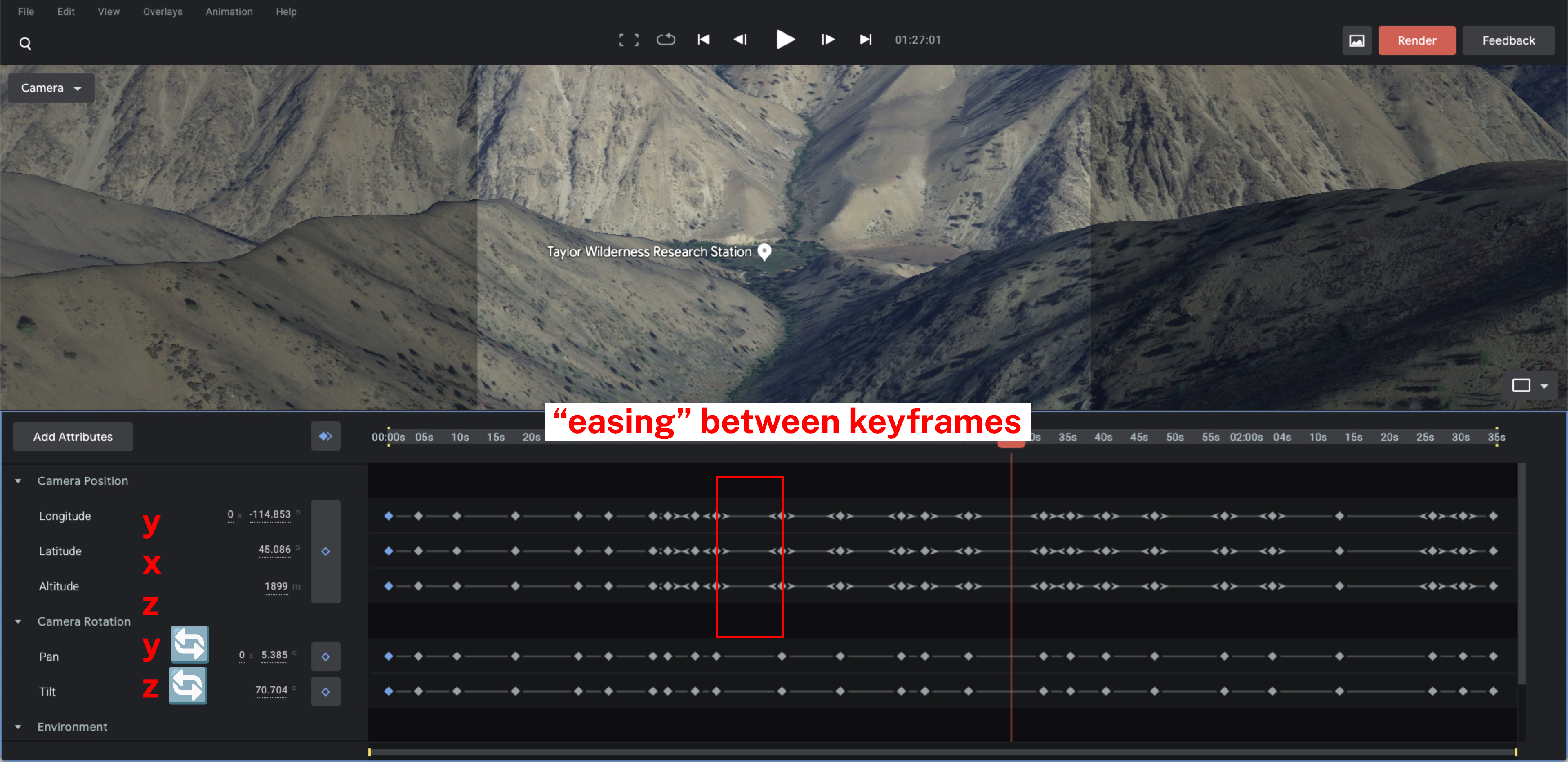
Google Earth Studio is essentially the creative suite version of Google Earth. The browser application is a “tool for animating geospatial information to create still and video content” that uses “the same imagery dataset and the same 3D rendering engine” but is equipped with controls to guide viewers through geographic data and export this media.
The conventional orientation controls are replaced with the following geographic analogues:
- Latitude = Y position (north-south)
- Longitude = X position (east-west)
- Altitude = Z position (elevation)
- Pan = Y rotation
- Tilt = Z rotation
Movement is established by creating keyframes that manipulate these characteristics along the timeline. Users can smooth movement through “easing” near a keyframe to buffer abrupt angles.
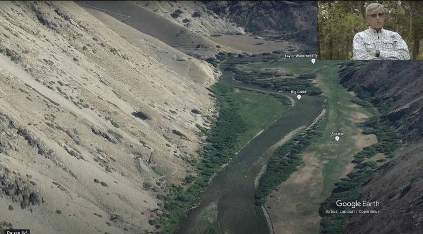
Landmark names, markers, path marks, polygons, and style changes were created in Google My Maps and exported as a Keyhole Markup Language file into Google Earth Studio. Custom landmark names were useful for informal shorthand developed over fifty years of operations at Taylor, as well as the various geological terms like the “benches” of sedimentary rock.
I experimented with importing a path linking all placemarkers, but due to the complexity of routes, these lines looked a little like silly string when zoomed out, becoming visual clutter. For oral histories with more linear trajectories, this could help illuminate distance and topography.
✺
I selected the oral history excerpts that I felt uniquely adept at providing a sense of the amount of time that it takes to navigate the area on foot and discussed locations that not only had a geographic scale but also chronological. In the first excerpt, wildlife researcher Dr. Maurice Hornocker recounts a four-day search for his colleague’s dog, Little Red. The emotional narrative demonstrates how far one could venture in the area before needing to come back to base. The multi-day structure of the story allowed me to experiment with time-of-day functionalities, another attribute you can manipulate in Google Earth Studio to visualize the rising and setting of the sun over days, months, or years. This adds a dynamic lighting component to the finished visualization and a more nuanced understanding of the environment they were navigating.
In the second excerpt, Professor Emeritus at U of I Dr. Ed Krumpe describes the wilderness area’s history, beginning with modern landmarks, then smaller geographic features, and finally an Indigenous site excavated in 1983. The animation allowed me to use scale and movement to convey the remoteness and historical depth of the region as the recording begins with modern landmarks like the airstrip and the station, then moves to small geographic features like the neighboring creeks, scopes out to massive geological elements.
Another key element I needed to consider in the digital movement was legibility and, more broadly, not making the viewer physically sick. The challenge was to design something which splits the viewers focus between following the story audibly and following the geography visually, but not overwhelm either sense. Ultimately, I found that slowing the movement as much as possible, shifting between a bird’s eye view (65°) and a high angle shot (45°) and stopping at the landmarks when they are mentioned for at least three seconds increased viewer comprehension and lowered any potential queasiness.
During these intermittent pauses, I found that a slight, slow vertical tilt downward still kept the place names legible while making for a more visually dynamic shot than an unnatural and robotic freeze frame. A full 90° top down angle is used only once in the video to convey a sense of historical magnitude when discussing the Indigenous sites in the area.
The archive’s eventual publication in April 2025 coincided with the U of I’s Renfrew Colloquium with a panel discussing the collection, including Dr. Ed Krumpe as a speaker, who noted the scale, speed and movement of the visualization made him think differently about his firsthand experience with “the sweat and blisters that it takes to move around in that… big, rough country.”
Thinking about this reaction, there is an opportunity in mapping oral history to both increase viewer empathy and understanding of the material by showing the physical difficulty of moving through an area, in the case of Maurice Hornocker’s multi-day rescue mission, and also let the viewer perceive and reframe their understanding of place that they’ve only previously understood at a human scale.
✺