Visualization and Conclusion

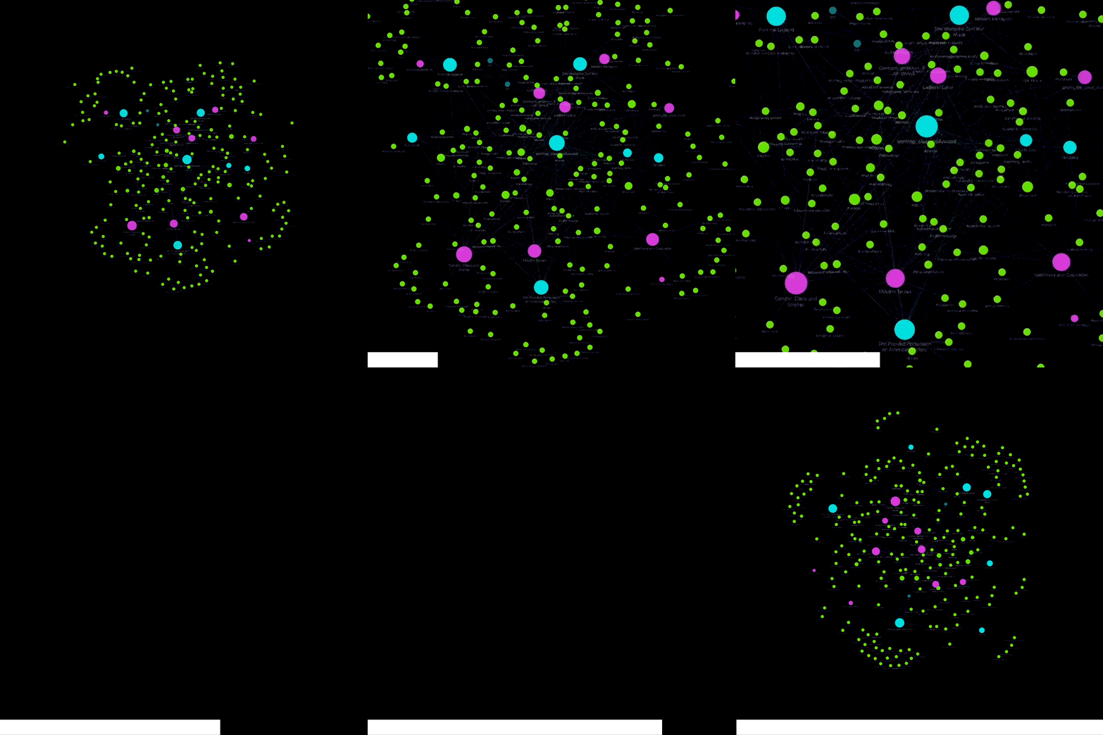
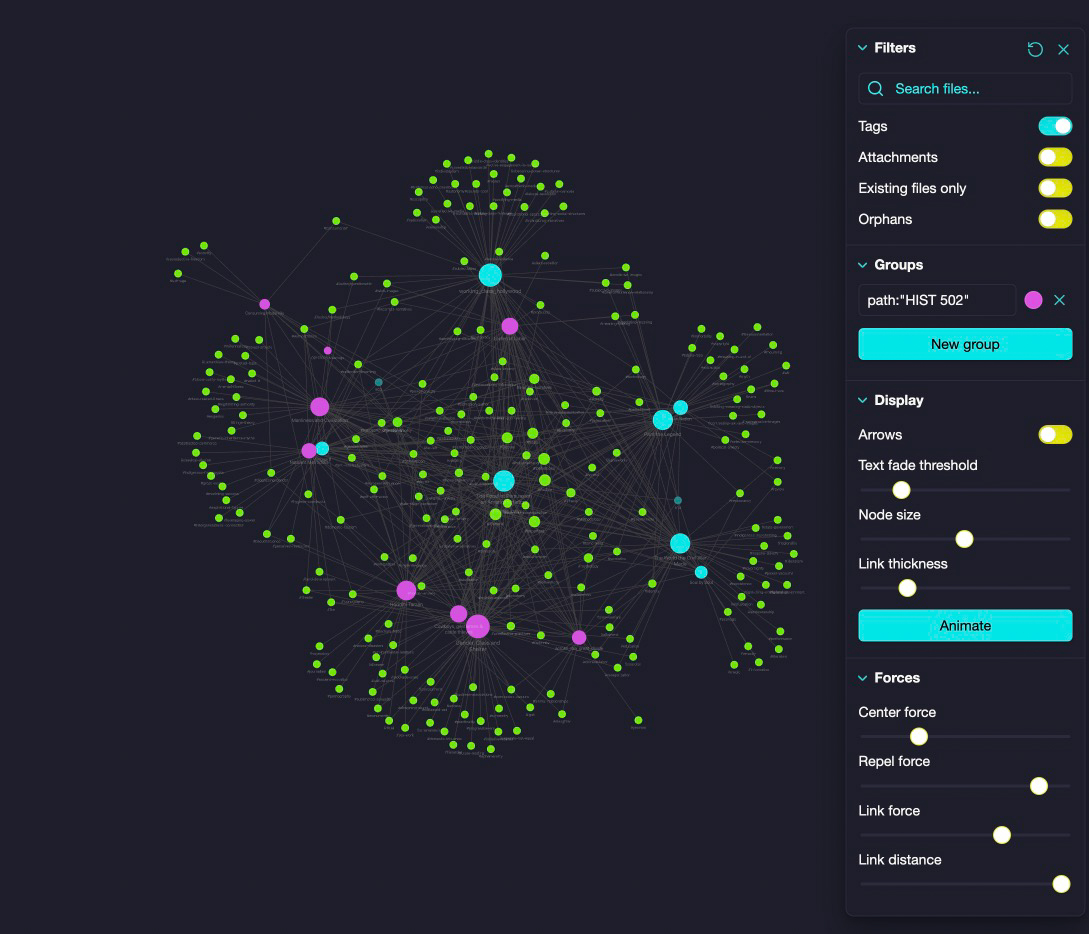
Like many data visualizations, the graph view of Obsidian is simply made up of nodes, the circles in this case, that represent an item and edges, which are the lines between the nodes. In this example, the nodes in blue and fuchsia are books and the green nodes around them represent tags.
◒
Opening the graph settings and working from the top down:

- I’ve toggled off viewing file attachments, existing files and orphans, i.e. notes that are not linked to anything else in the vault. This will leave us just with our primary notes document any other meeting notes that we have added tags to
- In Groups, I have added “path: “HIST 502” to differentiate the books between the two courses
- In Display, I’ve lowered the edge thickness and turned off the arrows. This is intended for researchers who are implementing linking in their documents
- Finally, in Forces, the default will display your nodes in a nice, neat little sphere, but it doesn’t tell you very much. However, I’ve found this setting provides some interesting insights:
(left=0%,
right=100%):
Center Force: 25%
Repel Force: 85%
Link Force: 75%
Link Distance: 100%
Tags nodes in the center are used the most throughout all texts. As these tag nodes move outward they are in proximity to the texts they are associated with. Tag nodes on the outside of the cluster are only associated with one text node. Additionally, the size of both text and tag nodes denote the number of texts or tags they are associated with.
✺
Conclusion
Using this method, we can see at a glance the thematic, methodological and technical similarities between books and across courses. I hope this approach can provide you with a starting point that you can customize to suit your own research needs. If you have any questions about this approach, always feel free to reach out to me at aweymouth@uidaho.edu.
About the Author
Andrew Weymouth is the Digital Initiatives Librarian at University of Idaho. In this position, he focuses on using static web technology to curate the institution’s special collections and partners with faculty and students to create custom fellowship projects. He also develops digital tools and workflows to enhance transcription, tagging, and image processing, making the university’s audio, text, and visual resources more discoverable for researchers.
Previously, he has created digital scholarship projects for the University of Washington and the Tacoma Northwest Room archives, ranging from long form audio public history to architectural databases and interactive network visualizations. Recent research includes using material history methodologies to reexamine early commercial imagery, as well as using field recording and embodiment techniques to make new connections in environmental history. His recent publications explore the formation of libraries in the American Far West, the history of Filipino Alaskero cannery workers and implementing new digital tools and workflows to text mine and tag oral history collections.